Cookie Warning
This website stores data such as cookies to enable site functionality including analytics and personalization. By using this website, you automatically accept that we use cookies.

CONFIGURATION
Almost everything is pre-configured, with default values, which work well in most of the cases. But you may want to customize your document. Also, in some cases it is impossible to define a one-size-fits-all default value. Nevertheless, the configuration is completely optional, however recommended. The configuration is done by supplying a configuration file in Microsoft INI file format. Comment lines begin with a semicolon (;). The file is divided into sections, which are marked like this: [SECTION NAME]. Inside each section there are keys. Each key consists of a name-value pair (like NAME=Value). The following keys are accepted:
TITLE: Defines the title of the document. This is what appears on the browser tab STRING
FONTFAMILYLIST: Comma separated list of fonts to be used in the document, beginning with the most preferred, ending with the least preferred one one. STRING
ROTATIONMODE: The model can be rotated using 2 DOFs (rotation around X and Y axes), which is more suitable for building models, or using 3 DOFs (rotation around X, Y and Z axes), which is a better choice for models to be shown from all sides. This is only the initial setting, the viewer can change it on the fly. Possible values: 2 (2D), or 3 (3D). INTEGER
ANIMATIONFREQUENCY:Defines the animation frequency in Hz. Can be changed interactively during presentation time. Can be any number. Negative value: animation in both ways. FLOAT
CANVASBACKGROUNDCOLOR:Defines the background color of the document. RGBA
EDGECOLOR: Defines the color of the sharp edges of the model (shown for better visibility). RGBA
MERGINGFACTOR: The corner nodes of the triangles will be merged if they are closer to each other than the merge distance. The merge distance is calculated by: ShortestEdgeLength / MERGINGFACTOR. FLOAT
SHARPANGLE: If the angle between adjoining triangle facets (measured between the surface normals) are greater than this value, then it is marked by a line (shown for better visibility). Degree. FLOAT
SHARPANGLE: If the angle between adjoining triangle facets (measured between the surface normals) are greater than this value, then it is marked by a line (shown for better visibility). Degree. FLOAT
EDGEQUALITY: Sharp edges are shown by a thick line. Possible values: 1: the best quality (biggest file size). 2: medium quality (smaller file). 3: No line thickening (smallest file). INTEGER
EDGETHICKNESS: Sharp edges are shown by a thick line. This value defines the line thickness in the model length unit. FLOAT
INNEREDGEELEVATION: Inner edges (edges between 2 triangle facets with less than 180 degrees between them) are not shown, even if we want to draw a line there. This is how WebGL works, unfortunately. One way to tackle the problem is to elevate the line above both facets. This tells, whether the inner edges to be elevated (1), or not (0). INTEGER
INNEREDGEELEVATIONFACTOR: This is the ratio between the largest extension of the model in any direction and the inner edge elevation: LargestExtension / Elevation. FLOAT
TRIANGLEDELETEFACTOR: triangles with very short edges can and should be excluded from the presentation. This is the ratio between the between the edge thickness and the shortest edge length of the given triangle: EDGETHICKNESS / ShortestEdgeLength. This is calculated for every triangles and compared to the TRIANGLEDELETEFACTOR. If the factor is greater than the defined value, the triangle will be eliminated. FLOAT
Table 1: INNEREDGEELEVATION explanation
| Image | Description |
|---|---|
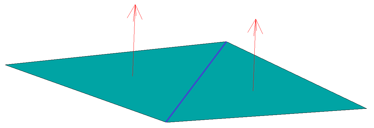 |
When the facet normals (red arrows) are approximately parallel, then the edge between them (blue line) may, or may not be visible. It also possible, that once appears, then by rotating the model disappears. |
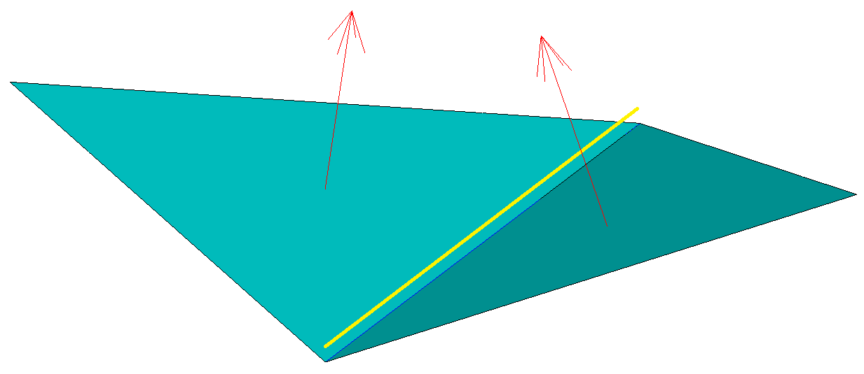 |
When the angle between the facet normals is less than 0° (concave), then the edge goes invisible. In this case it is recommended to apply some edge elevation (yellow line). In this way we can ensure, that the elevated edge will always be visible. |
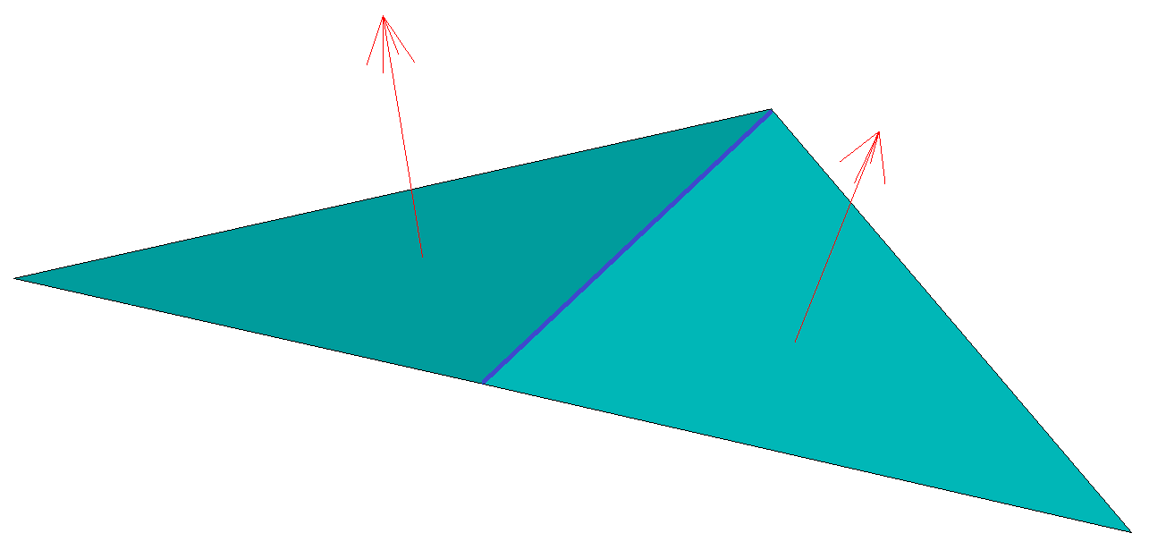 |
When the angle between the facet normals is more than 0° (convex), then the edge is always visible. In this case the edge elevation is unnecessary. |
| Image | Description |
|---|---|
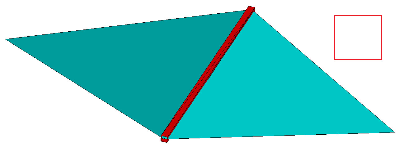 |
When the facet normals (red arrows) are approximately parallel, then the edge between them (blue line) may, or may not be visible. It also possible, that once appears, then by rotating the model disappears. |
 |
With EDGEQUALITY=2 the sharp edges will be thickened by drawing 6 extra triangles, which form a triangular section. This provides medium visibility and it will also increase the file size and the memory consumption. Worse than EDGEQUALITY=1, but takes less resources. |
 |
With EDGEQUALITY=3 the sharp edges will not be thickened. This provides the worst visibility but it will not increase the file size and the memory consumption. |
Usually a modell includes both covex and concave facet connections. Therefore inner edge elevation is almost always necessary. Alternatively the EDGEQUALITY (1, or 2) can be used.
INCLUDEUSERLABEL: The author can have a menu item in the top menu (rightmost place) pointing to his/her own home page, or email address. Possible values: 0: no, or 1: yes INTEGER
USERLABEL: Author menu item caption. STRING
USERSITE: Homepage, or email address of the author. STRING
FULLSCREENBACKGROUNDCOLOR: Full screen menu item background color in the top menu. RGBA
TEXTCOLOR: Top menu text color. RGBA
FULLSCREENTEXTCOLOR: Full screen menu item text color in the top menu. RGBA
HOVERCOLOR: Top menu hover color. RGBA
DROPDOWNHOVERCOLOR: Drop down menu hover color. RGBA
FONTFAMILY: Top menu font family. STRING
FONTWEIGHT: Top menu font weight (100: light weight; 900: normal weight). Possible values: from 100 till 900 in 100s steps. INTEGER
LANGUAGE: Menu language ID. 1: English (default). INTEGER
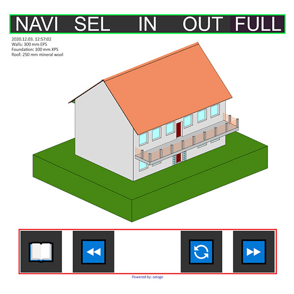
RESPONSIVELIMIT: Horizontal screen resolution limit. If the horizontal window size (or screen size on phone, or tablet) is smaller than this, the mobile menu is shown, which is optimized for handheld devices (tablet, phone). Also includes the length unit. E.g.: 600px STRING
BACKGROUNDSIZE: Desktop top menu vertical size. Also includes the length unit. E.g.: 46px STRING
TEXTSIZE: Desktop top menu text size. Also includes the length unit. E.g.: 16px STRING
HORIZONTALPADDING: Desktop top menu gap between the caption and the border. Also includes the length unit. E.g.: 16px STRING
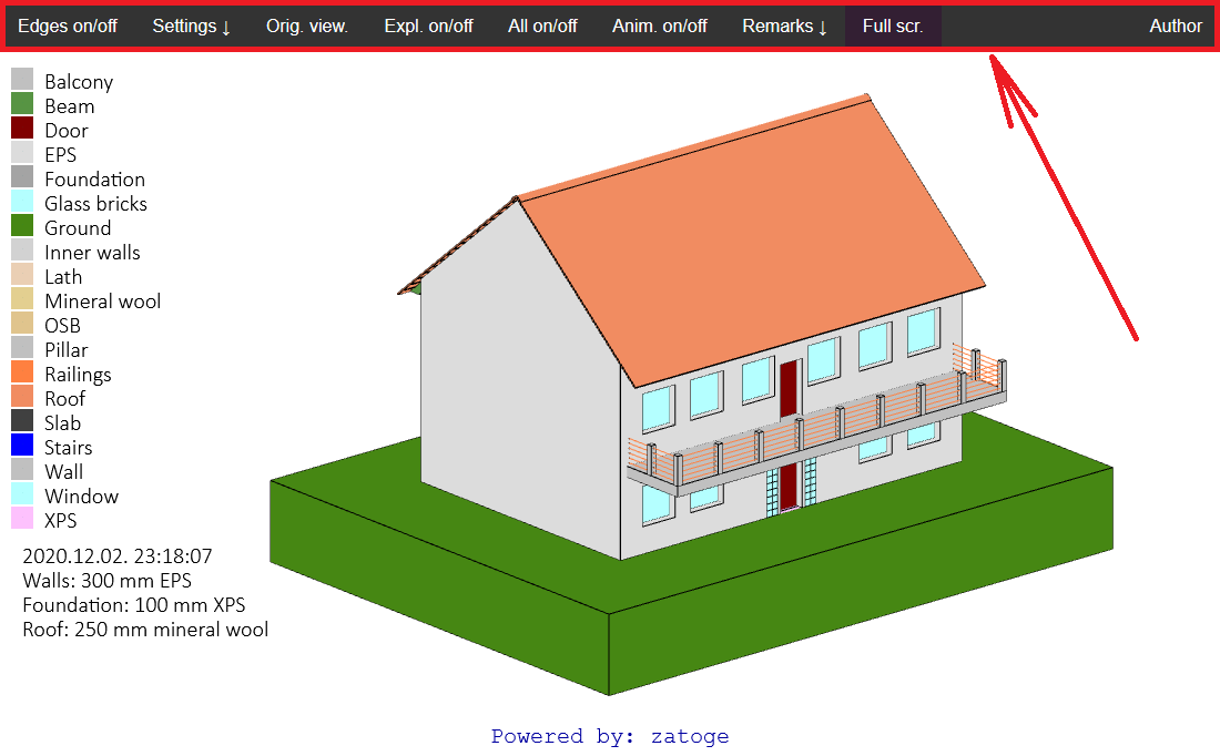
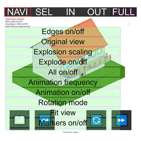
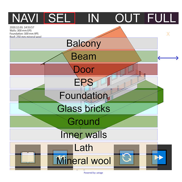
SUBMENUBACKGROUNDCOLOR: Sub-menu background color. RGBA
SUBMENUTEXTCOLOR: Sub-menu text color. RGBA
REMARKSBACKGROUNDCOLOR: Background color of the remarks items of the sub-menu. RGBA
SUBMENUALPHA: Alpha channel of the sub-menu. Possible values: any number between 0.0 and 1.0 FLOAT
SUBMENUOUTLINECOLOR: Border color of the sub-menu. RGBA
SUBMENUOUTLINEWIDTH: Border width of the sub-menu items. Also includes the length unit. E.g.: 1px STRING
SUBMENUCLOSERIGHT: Sub-menu upper close button (X) right padding. Also includes the length unit. E.g.: 45px STRING
SUBMENUCLOSESIZE: Sub-menu upper close button (X) size. Also includes the length unit. E.g.: 3vh STRING
BACKGROUNDSIZE: Sub-menu item size. Also includes the length unit. E.g.: 7vw STRING
TEXTSIZE: Sub-menu text size. Also includes the length unit. E.g.: 7vw STRING
CLOSEBUTTONBACKGROUNDCOLOR: Sub-menu bottom close button background color. RGBA
CLOSEBUTTONTEXTCOLOR: Sub-menu bottom close button text color. RGBA
CLOSEXCOLOR: Sub-menu upper close button (X) text color. RGBA
SCROLLBARWIDTH: If the sub-menu has too many items, it gets bigger than the screen size, therefore it has to be scrolled vertically. This is the width of this band, the sub-menu items don’t reach into this region, so the user does not press any menu item accidentally while scrolling. Also includes the length unit. E.g.: 10vw STRING
MENUITEMFONTSIZE: Font size of the sub-menu. Also includes the length unit. E.g.: 6vh STRING
MENUBOTTOMGAP: Gap between the lowest menu item and the bottom of the screen. Also includes the length unit. E.g.: 1vh STRING
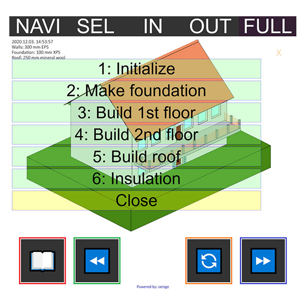
SCRIPTBUTTONWIDTH: For playing scripts, there are 4 buttons at the bottom. This is their width. Also includes the length unit. E.g.: 15vw STRING
SCRIPTBUTTONHEIGHT: This is the script button height. Also includes the length unit. E.g.: 15vw STRING
SCRIPTBUTTONGAP: Gap between the script buttons. Also includes the length unit. E.g.: 4vw STRING
SCRIPTBUTTONFONTSIZE: Font size of the script buttons. Also includes the length unit. E.g.: 8vw STRING
Table 2: Mobile menu
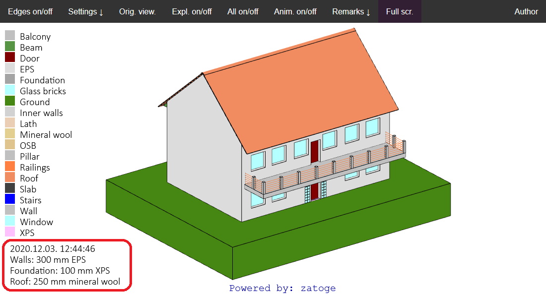
COUNT: Number of static text lines. INTEGER
TEXT1: First static text line. STRING
TEXT2: Second static text line. STRING
TEXT COUNT: Last static text line. STRING
FONTFAMILY: Static text font family. STRING
BACKGROUNDCOLOR: Static text background color. RGBA
FONTCOLOR: Static text color. RGBA
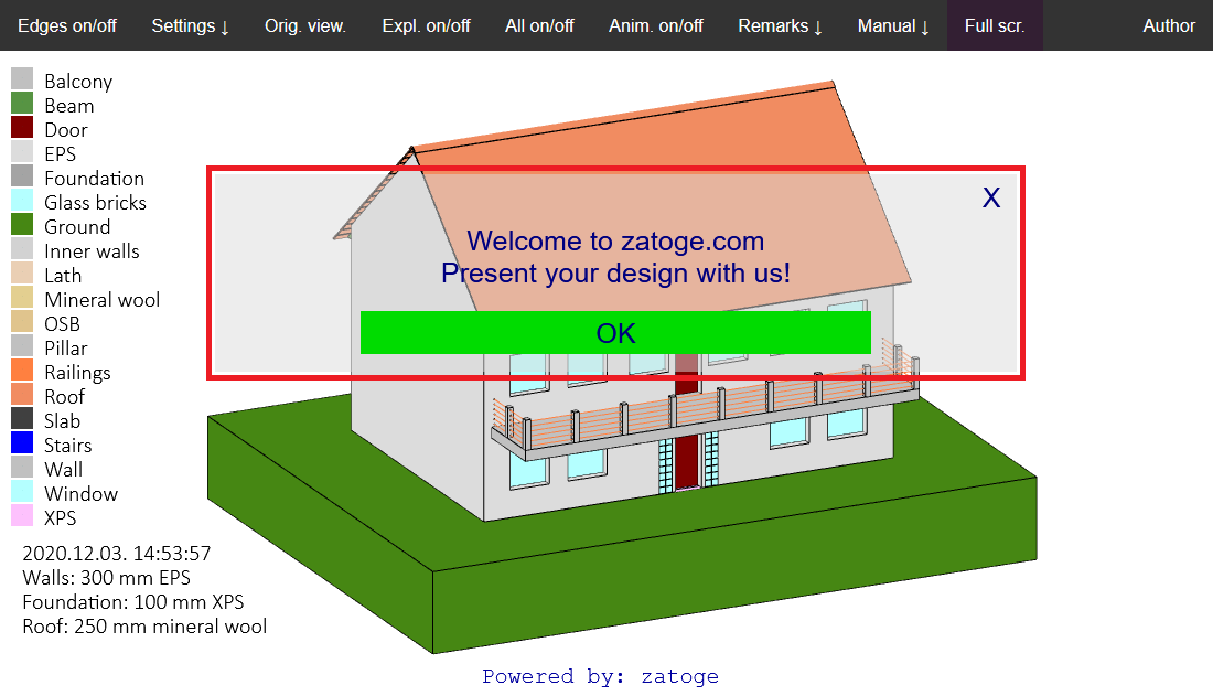
CLOSEBUTTONCAPTION: Caption of the close button (X in the upper right corner) in the dialog box. STRING
BUTTONCAPTION: Caption of the button in the dialog box. (Usually OK, or Close). STRING
BACKGROUNDCOLOR: Dialog box background color. RGBA
FONTCOLOR: Dialog box text color. RGBA
BUTTONCOLOR: Static text font family. STRING
BACKGROUNDCOLOR: Dialog box button background color. RGBA
WINDOWOUTLINECOLOR:Dialog box frame color. RGBA
BUTTONWIDTH: Dialog box button width. Also includes the length unit. E.g.: 50% STRING
RADIOBUTTONWIDTH: Dialog box radio button width. Also includes the length unit. E.g.: 80% STRING
WINDOWOUTLINETHICKNESS: Dialog box frame thickness. Also includes the length unit. E.g.: 1px STRING
BUTTONOUTLINETHICKNESS: Dialog box button frame thickness. Also includes the length unit. E.g.: 1px STRING
RADIOBUTTONOUTLINETHICKNESS: Dialog box radio button frame thickness. Also includes the length unit. E.g.: 1px STRING
FONTFAMILY: Dialog box font family. STRING
FONTSIZE: Dialog box font size. Also includes the length unit. E.g.: 4vh STRING
FONTWEIGHT: Dialog box font weight. 100: thinnest. 900: normal weight. Possible values: any integer between 100 and 900 in 100s steps. INTEGER
WINDOWGAP: Gap between the lines in pixels. Does not include the length unit. E.g.: 10 INTEGER
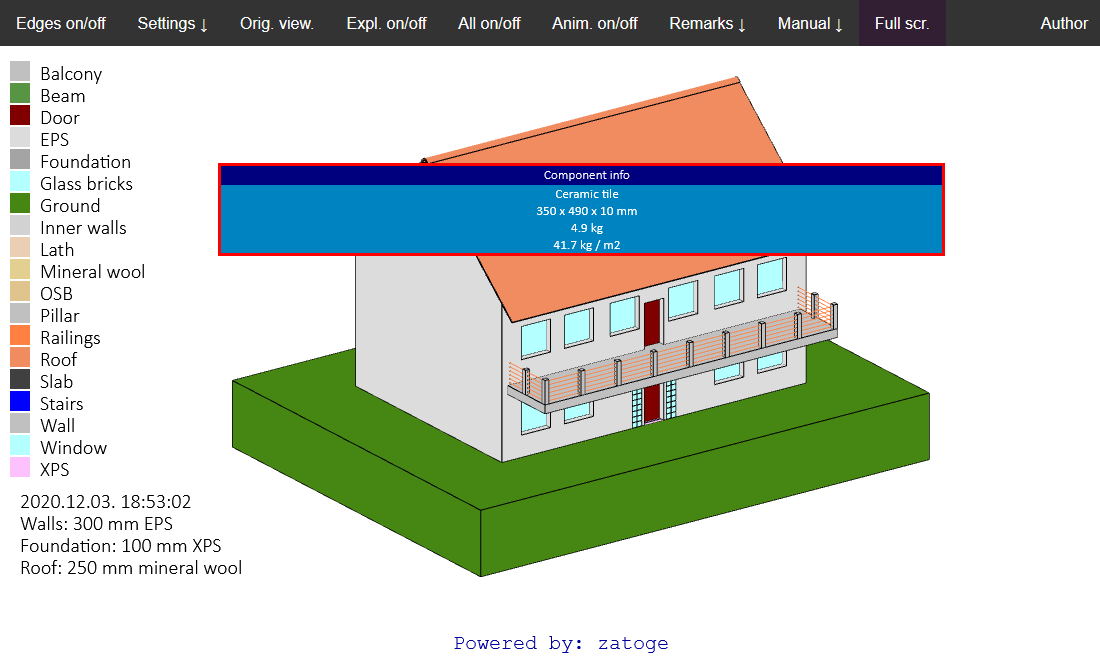
The popup includes volume specific information defined in the project file [VOLUMES] section. The popup window is activated by clicking on the specific volume with the right mouse button. Therefore this will be shown only in the desktop environment. Alternative on mobile devices: markers and labels.
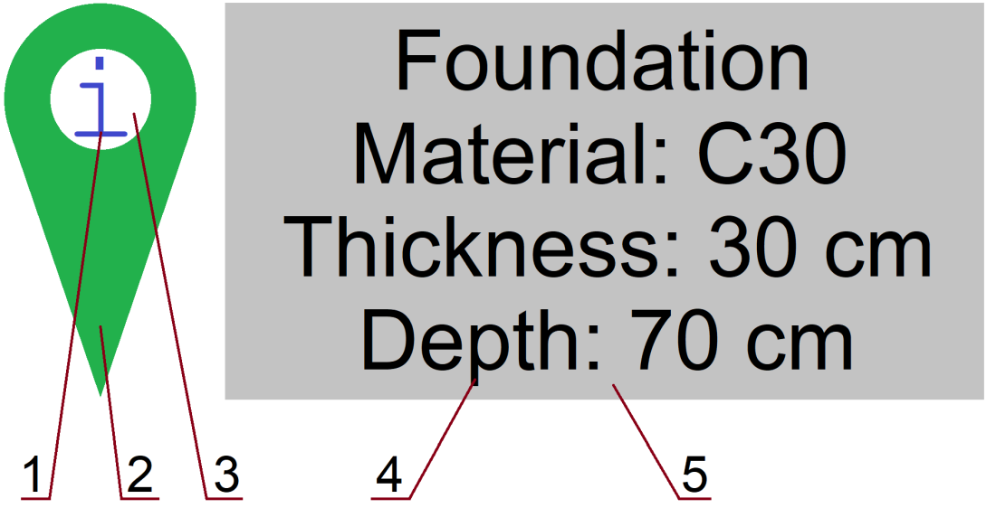
The marker and the belonging label can be shown in both the desktop and mobile environment.

HEADERBACKGROUNDCOLOR: Popup window header background color. RGBA
BACKGROUNDCOLOR: Popup window background color. RGBA
FONTCOLOR: Popup window text color. RGBA
WINDOWOUTLINECOLOR: Popup window frame color. RGBA
WINDOWWIDTH: Popup window width. Also includes the length unit. E.g.: 70% STRING
WINDOWOUTLINETHICKNESS: Popup window frame thickness. Also includes the length unit. E.g.: 1px STRING
FONTFAMILY: Popup window font family. STRING
FONTSIZE: Popup window font size. Also includes the length unit. E.g.: 2vh STRING
FONTWEIGHT: Popup window font weight. 100: thinnest. 900: normal weight. Possible values: 100,200,300..900 INTEGER
MARKERSCALE: Marker is originally drawn in large size. This is its scale factor. With current screen resolutions 0.25 is a good value. FLOAT
MARKEROUTERCOLOR: #2 RGBA
MARKERINNERCOLOR: #3 RGBA
MARKERLETTERCOLOR: #1 RGBA
LABELBACKGROUNDCOLOR: #5 RGBA
LABELFONTCOLOR: #4 RGBA
LABELWINDOWOUTLINECOLOR: Border color of #5 RGBA
LABELWINDOWWIDTH: Width of #5 Also includes the length unit. E.g.: 10vw STRING
LABELWINDOWOUTLINETHICKNESS: Border thickness of #5. Also includes the length unit. E.g.: 1px STRING
LABELFONTFAMILY: Font family of #4 STRING
LABELFONTSIZE: Size of #4 Also includes the length unit. E.g.: 1vh STRING
LABELFONTWEIGHT: Font weight of #4. 100: thinnest. 900: normal weight. Possible values: 100,200,300..900 INTEGER
HEADERBACKGROUNDCOLOR: Popup window header background color. RGBA
COUNT:Number of messages (shown is separate dialog boxes)
REMARK1:This is the first message
REMARK2:This is the second message
…
REMARKCOUNT: This is the last message
Color definition by RGBA
RGBA stands for red, green, blue and alpha components. The red, green and blue are integers (0-255), and it tells the intensity of the given channel. The alpha channel is a real number (0-1) and it means the opacity: 0 is fully transparent (invisible), 1 is completely opaque.
Examples:
- White opaque: 255,255,255,1
-
Black opaque: 0,0,0,1
-
Red semi-transparent: 255,0,0,0.5
Size definition (this is CSS)
The size of an object can be defined in many ways: % : in portion of the parent object (100% means the whole size)
vw : in portion of the horizontal screen resolution (100vw means the whole horizontal screen size)
vh : in portion of the vertical screen resolution (100vh means the whole vertical screen size)
px : in pixels (100px means 100 pixels)
Examples:
-
60% of the width of the viewport's initial containing block: 60vw
-
50 pixel: 50px
